Llamagram identity
Brand.
Everything that makes Llamagram look like Llamagram. The mark, the gradient, the colors, the type, and the rules. When in doubt, come back here.
The logo
This is our mark.
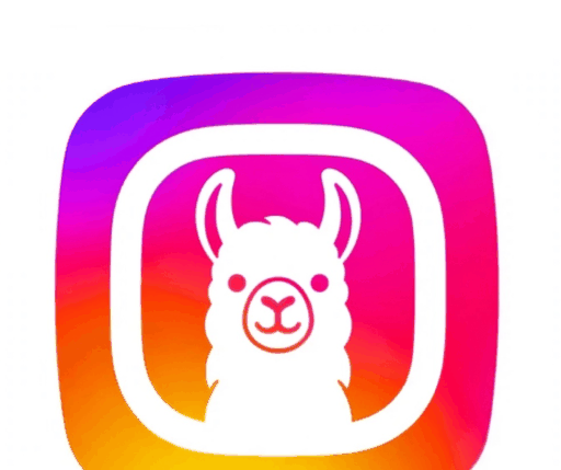
A white llama inside a thick white ring, on an Instagram style gradient that runs purple to magenta to orange to yellow. Friendly, social, unmistakable at any size.
The mark
The icon alone is the primary logo. Use it everywhere.
The mark, on dark
The gradient does the work, so the mark needs no inverted version.
The icon is the logo. Not the text, not a wordmark. The mark.
Logo variations
Three ways to show it.
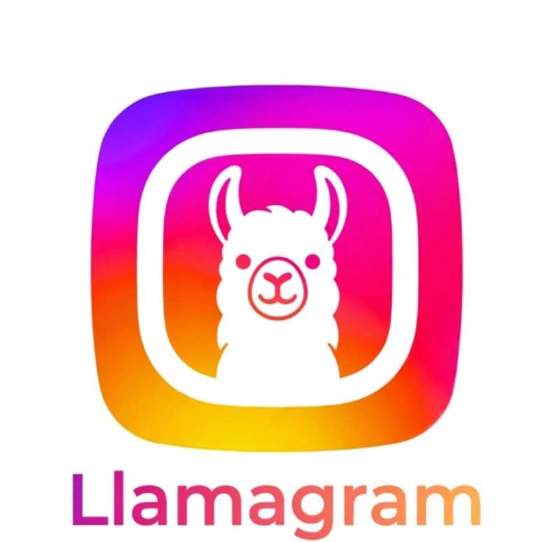
The icon is the primary mark. The full lockup (icon plus wordmark) is for headers and brand moments. Never make a new variation.
Full lockup
Icon plus wordmark. For page headers, splash screens, and brand moments.
Icon alone
The everyday logo. Avatars, favicons, app icons, buttons.
On dark
Works on any dark surface. No outline, no glow, no changes.
Small sizes
The thick ring keeps it readable down to 32px. Below that, it is too small to use.
Usage
Clear space and minimum size.
Give the mark room to breathe. Keep clear space equal to the ring width on all sides, and never set it smaller than 32px.
x
x
x
x
x equals the width of the white ring. Nothing enters this zone: no text, no edges, no other logos.
Minimum digital: 32px
Favicons, tab icons, tiny UI. Any smaller and the llama disappears.
Minimum print: 12mm
Merch, stickers, packaging. The gradient needs room to show its colors.
Color
The gradient.
Four colors, one diagonal flow. Purple leads, yellow lands. Use the full gradient for brand moments, single colors for UI.
The Llamagram Gradient
135deg, #833ab4 to #feda75
The hero move. Logo backgrounds, primary buttons, launch moments. Never reverse the direction.
Purple
#833ab4
The lead color. Where the gradient starts, and the accent for links on light backgrounds.
Magenta
#d62976
The heart of the gradient. Eyebrows, active states, notifications.
Orange
#fa7e1e
Warmth. Highlights, hover states, moments of delight.
Yellow
#feda75
The landing color. Ends the gradient, never starts it. Celebration moments.
Ink
#1d1d1f
Headlines, body text, dark sections. Never pure black.
Gray
#6e6e73
Secondary text, captions, timestamps. The quiet voice.
Light Gray
#f5f5f7
Section backgrounds, card fills, calm separation.
Line
#e8e8ed
Borders, dividers, card edges. Barely there.
White
#ffffff
The canvas. The feed background, the breathing room.
Typography
Type.
The system font stack, set with confidence. Big headlines, tight tracking, friendly body copy.
The stack
No web fonts, no loading, no flash. It looks native everywhere because it is native everywhere.
Headline
Share something kind.
Weight 800, letter-spacing -0.03em, line-height 1.05. Fluid size with clamp().
Eyebrow plus lede
Fresh in your feed
The quiet line under the loud headline. 20px, gray, sets up the section.
Eyebrow: 13px, weight 700, letter-spacing 0.14em, uppercase, gradient or magenta.
Body
Body copy runs at 17px with a 1.5 line height, in Ink. Captions and timestamps drop to 14px in Gray, so the photos do the talking.
Buttons
Pill shape, 700 weight. The gradient is the primary action, ink for secondary, ghost for quiet.
Eyebrow, headline, lede
Section label
The big idea.
The supporting line, in gray.
Every section opens with this trio, in this order. It is the rhythm of the whole brand.
In the wild
The brand in the wild.
What the identity looks like out in the world: the app icon, the feed, the profile, the merch.
@llamagram
Share something kind.
Good morning
Your feed is full of kindness.
llamagramLlamagram
Do and don't
Treat it right.
The mark is simple, so mistakes show. These are the big ones.
Use the official files
Download the mark from this page. Never redraw it, screenshot it, or rebuild it from memory.
Stretch or squash it
The icon is a square. Keep the aspect ratio, always. If it looks wrong, it is wrong.
Give it a clean background
White, light gray, or dark. The gradient needs a calm surface to shine against.
Recolor or clash it
Never change the gradient colors, go grayscale, or place it on a busy clashing background.
Keep it readable
32px minimum on screen. The llama and the ring should always be recognizable.
Add effects
No rotation, no drop shadows, no outlines, no bevels. The mark ships finished.
House rules
The non-negotiables.
These keep the brand honest.
-
1
The icon is the logo. Not the text.
The mark is the app icon alone. The wordmark is a lockup for headers, not a standalone logo.
-
2
The gradient always flows purple to yellow.
135 degrees, top left to bottom right. Never reverse it, never go vertical.
-
3
It is "Llamagram", one word.
Capital L, lowercase rest. Never "Llama Gram", never "LLAMAGRAM".
-
4
No em-dashes, anywhere.
Commas, colons, periods, parentheses. The dash with spaces around it is banned from brand copy.
-
5
The gradient is earned, not sprayed.
One gradient moment per view is plenty. If everything gradients, nothing does.
-
6
Kind over clever.
Llamagram is the kind corner of the internet. The brand sounds like a friend, never a billboard.
Tokens
The tokens.
Copy-paste ready. Drop this :root block into any new page and it will look like us.
/* Llamagram brand tokens */
:root {
  --grad: linear-gradient(135deg, #833ab4 0%, #d62976 45%, #fa7e1e 80%, #feda75 100%);
  --purple: #833ab4;    /* lead color */
  --magenta: #d62976;   /* heart of the gradient */
  --orange: #fa7e1e;    /* warmth */
  --yellow: #feda75;    /* landing color */
  --ink: #1d1d1f;       /* headlines, body */
  --gray: #6e6e73;      /* secondary text */
  --line: #e8e8ed;      /* borders */
  --light-gray: #f5f5f7; /* section bg */
  --white: #ffffff;
}
Assets
Take the files.
The official artwork, straight from the source. Right click to save, or open in a new tab.

